SHUHARI
BRAND strategy & DEVELOPMENT
STORE CONCEPT DESIGN
A life of balance.
In 2016, Maeda-en and founder Taku Maeda, inventor of matcha ice cream and matcha lattes, came to Hornall Anderson with an incredible opportunity. At the time, matcha (and many aspects of Japanese culture) did not have the recognition in western culture that they do today. Inspired by Starbucks, Taku had a dream: to meet those who may not be familiar where they are at, and introduce them to the beauty and health benefits of matcha and Japanese tea traditions, both old (tea ceremony) and new (matcha soft-serve and spritzes), in a new brand and more importantly, in a physical space.
The name Shuhari is a direct reference to a Japanese term defining the stages of learning to achieve mastery, commonly used in reference to martial arts. Shu (守) alludes to the obedience of traditional wisdom; Ha (破) is the point at which a learner breaks away from established rules; and Ri (離), whereby the learner surpasses conventional teachings in their own mastery, thereby achieving a unique style and independence. This name became the perfect vessel and fuel for the vision of this new brand and cafe, whose goal was to bring the ancient Japanese tradition of green tea to a western palate and environment, in a way that respected its legacy but made for a unique and exciting new experience.

Brand Identity
One of my favorite logos, to date, the Shuhari mark is inspired dually by a Japanese hanko stamp, used traditionally as a signature, and the process of Shu Ha Ri, the letterforms mimicking the beautiful unfurling of tea leaves in a cup. Wabi Sabi lives in this mark, perfectly imperfect, but finding balance.
The secondary mark references each of the phases of learning while graphically referencing the Maeda-en mark. Shu is represented by a stone or bit of soil, Ha by the form of water, flowing freely to the next and final stage, Ri, where a tea leaf and new, flavorful learnings have sprung forth.


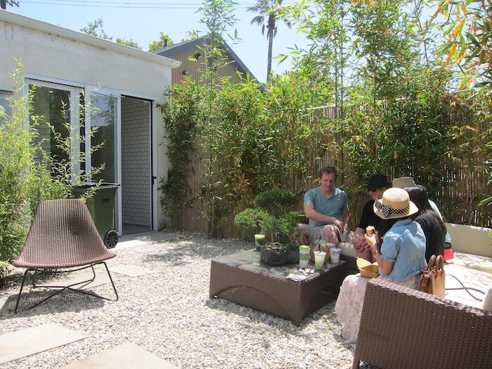
Store Concept Design
I partnered with a small team of brand strategists, a copywriter and an environmental designer to translate my vision for the brand identity into physical spaces, textures, and customer experiences. As our client narrowed in on possible real estate in Abbot Kinney, Los Angeles, for the flagship shop, we created a scalable and memorable store experience flow that could be applied to a variety of footprints, imparting a consistent experience, no matter the location.
Materials, furnishings, and servingware were inspired by the thoughtful craftsmanship associated with Japanese design while visually and experientially delivering on the brand promise of balance, with which comes contrast: light and dark, smooth and rough, organic and geometric, old and new.